
Eleva Educação · 2021
Canal Eleva.
Canal Eleva is an online platform that provides video lessons to the students of the schools of the Eleva Educação group and partners.
How does Canal Eleva work?
To access it, students go through the unified login of the Eleva Portal, then click the reserved Canal Eleva link of the school where they study. For example: a student of Colégio Pensi logs into the Eleva Portal and, once logged in, sees the educational portal of Colégio Pensi with an access link to Canal Eleva.
For teachers the procedure is the same, with one addition: the possibility of publishing video lessons for their subjects through a reserved link on their profile.
The problem
The main problem Canal Eleva solves is making the educational content available across the school years, and being a solid knowledge base for the student after the classroom.
Canal Eleva 1.0
The first version of Canal Eleva was widely celebrated at Eleva Educação, and it was an achievement. Having practically every school year with digitised lessons was fundamental for the moment of the pandemic (Covid-19), when the population went through sanitary restrictions and that impacted the class model: in-person before, remote classes at the start of the pandemic.
P.S.: I did not work on Canal Eleva v1, only on Canal Eleva v2.
Technologically speaking, the platform was built with KnockoutJS on the front end and C# on the back end.
Canal Eleva 2.0
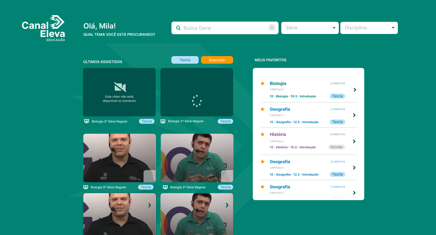
Canal Eleva was technologically upgraded to Angular 9/10 on the front end and .NET Core on the back end. On top of that, the visual identity was updated, with the components following the new standard defined by Fibo, the new Design System created by Eleva Educação.
The technology-evolution and redesign project lasted 1 month. The redesign process itself lasted 2 weeks.
What was my role in this project?
I was the designer responsible for the UX and UI during the redesign process of Canal Eleva. Taking into account the time window available and the opportunity to evolve the user experience, I chose to start with a discovery process, interviewing students and teachers to find out what the pain point was when using Canal Eleva.
Five people were interviewed, from the following profiles: students (3), teachers (1), and help-desk analysts who support the platform (1).
Discovery
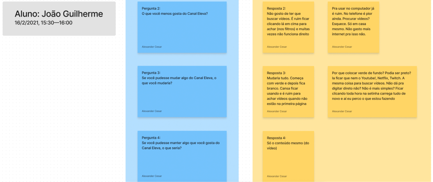
The result was that the current platform was not that precise in the process of locating the video the student needed to watch — and that made it unattractive to keep studying by watching videos at home.
Besides that, students avoided using the phone to watch the videos, and it had nothing to do with the recording quality: it was the user experience of locating the video they needed to watch, related to the lesson they had studied that day.
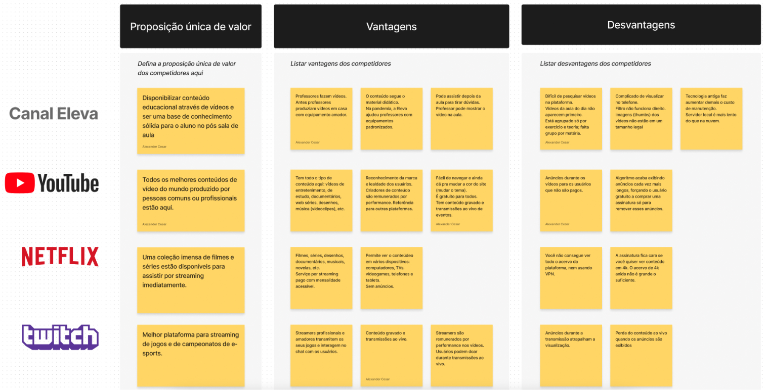
Starting from that information, questions were asked about the sites, platforms and apps the users like most, and the reason for their admiration. The answers pointed to the ease of use that the main streaming platforms offer.
Wireframe + decision
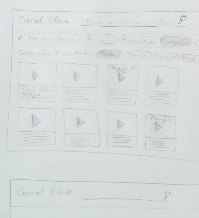
That discovery stage guided the collection of information about the competitors (via benchmarking), and made it easier to decide which path to follow after sketching (wireframing) and discussing the feasibility of implementing some new features with the developers.
And in decision terms, we chose to put the emphasis on what everyone would see first — Canal Eleva itself — instead of building the administrative side, where videos are registered, at the same time.
Conclusion
Because there was a Design System with ready-made components, the ideas raised on paper were quickly translated inside Figma — so quickly that they were presented immediately to the users and the deciding stakeholders, allowing us to collect data in real time and iterate on what could be modified and implemented right there with the team.
The visual and user-experience feedback was collected in a session with everyone involved for the first presentation of the layout, and by providing specific links so the users could navigate it on their own afterwards.
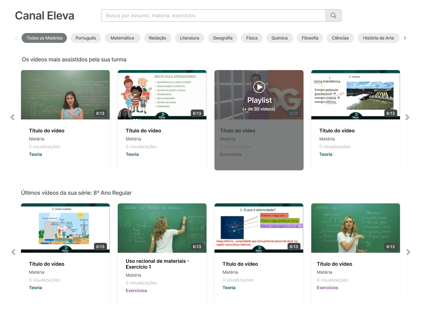
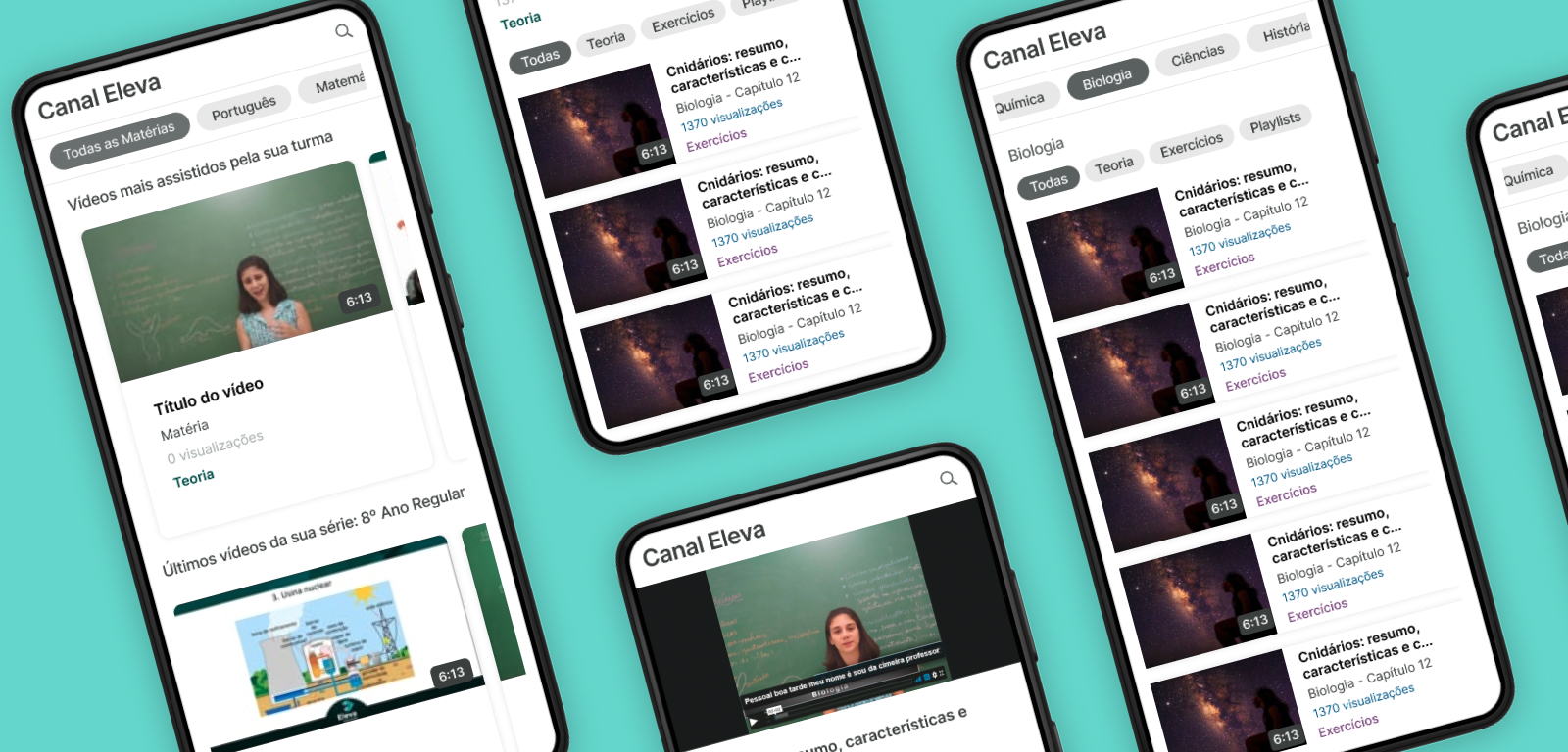
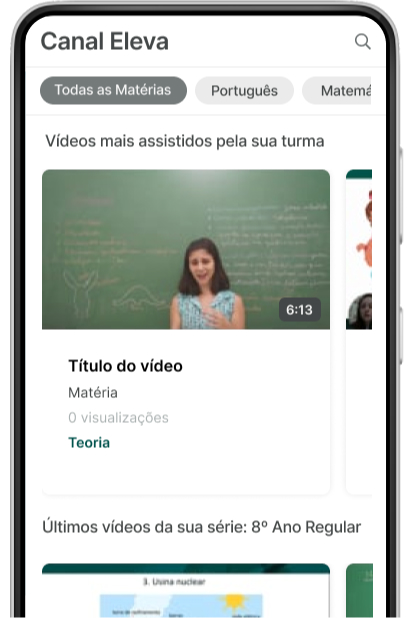
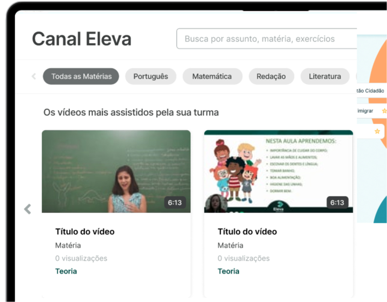
With that, we reached the finished flow in the desktop and mobile versions, as you can see below.
What were the results of this work?
Increased user satisfaction (measured via NPS). Canal Eleva became a case inside the Eleva Educação group for implementation speed, technology upgrade and the savings in resources from migrating the previous structure to the cloud.
Access to the videos was optimised for mobile devices after the hosting provider changed. Teachers recorded new lessons with new equipment, and the quality of the videos went up.
Increased user satisfaction, measured via NPS. Canal Eleva became a case inside the Eleva Educação group for implementation speed, technology upgrade and the resource savings of migrating the previous structure to the cloud.